Charts have become an essential tool for mapping and analyzing the data for a competitive comparison. We often come under the need for data scrutiny to grab useful information. Based on quick data analysis, visual analytics give liberty to read and justify data to make a better business decision. In this context, the waterfall chart is one of the best visual charts for viewing the integrity of a vast set of data. The waterfall chart is an offshoot of the bar chart, which comes into existence after joining a couple of bar chart springs.
How this chart helps view data to get the idea of information makes better sense. This guide will bring the waterfall chart validity and application in real-life scenarios.
Let’s explore an in-depth analysis of the waterfall chart.
What is Waterfall Chart?
A waterfall chart comes under many charts for visual data analysis that enables a business to turn the cumulative impacts of a product launch into sequential positive and negative trends. Waterfall charts are considered useful when analysing a frequent gradient of numeric transition in the quantitative value of a number that is the case to increase or decrease incrementally. Numeric sets within the data analysis can be based on time or data type. Whole data columns represent subsequent final values, while floating in-between columns depict intermediate data values entailed from the value of the previous column. Waterfall charts can also be helpful in complex analyses with multiple columns representation and values that spread across the axis of the chart.
How is Waterfall Chart Used in Businesses?
A waterfall chart is also called the bridge chart. It gets known as the bridge chart because of its view-ability, just like the cascade. A waterfall chart is commonly used to show a total of the continuous model as values are added or subtracted with an increase or decrease in values.
What Key Information does Waterfall Chart Show?
Cascade Charts’ importance in Data Visualization
Waterfall charts are most frequently used to depict the nature of a product fluctuation or trend-changing fashion after eliminating or adding some numeric values or digits either in the composition of a metric or the range of change for a resultant metric over time.
For instance, you can make sense that waterfall charts are often used to show the frequency of change of a corporation’s operating ROI with margin or the profit of a business’s final results.
When you hear the word “waterfall,” that’s typically what you call to mind. However, the common senses can perceive you are going to think about a different kind of cascade — the waterfall chart that shows a data visualization flow rhythmic blow.
Waterfall Charts Help in a Data Visualization
Data resource that can assist you in gathering and tracking important chunks of data such as traffic goals and lead generation. Below, let’s review what a waterfall chart is, how to read one, and create one.
Why use a waterfall chart?
It would be best to use a waterfall chart instead of other charts when trying to visualize data that experiences both gains and losses. It’s especially useful to see how a loss affects a subsequent value.
Validation of Waterfall Charts in Marketing
One of the vital reasons that waterfall charts are considered efficient in marketing and product launch strategy. It is because they render a contextual presentation to the data with elaborative incremental or decremented intervals of data flow. Most data visualization in terms of marketing or advertisement gets under lambaste with neglected circumstances that cause a noticeable fall or rise in numbers, such as frequency of product trends and downsizing.
For instance, let’s say a YouTuber undermines a waterfall chart of his YouTube video views over time. Rather than using a line graph that only presents the total number of views in a passage of time, a waterfall chart is more vital to depict information that how many views you got at which specific time and by which age group — and how that impacts subsequent data in a positive uptrend or negative declining trend for the views.
Why is Waterfall Chart Imperative to Use?
At first glance, these depictive charts might be hard to perceive. Below, let’s explore why to use the Cascade chart and how to analyse a waterfall chart.
When should you use a waterfall chart in your visual?
The statisticians and data analysts recommend that the company use a waterfall chart in place of other ordinary chart types to view information. It is well to undertake the cascade charts upon trying to view data visualization with effective margin notices in a row of glance reading. It is recommended because it experiences both gains and losses with marginal upturn or downturn of the data rhythm. It’s especially helpful if you need to visualize data that shows how a loss stream subsequent values are going in a way.
Are Waterfall Charts Good?
More arguably a waterfall chart is thought to be a better option to show you the data where you started and where you left, viewing the data flow up with an elaborative streamline of the understanding that how you got the optimal point.
In the following example, a YouTuber posts a video of him and studies the viewership density, and you can estimate what hours gained the most views and organic traffic as compared to the other videos on the YouTuber’s channel. You can also peek through the fact that how good or slow traffic gained or lost respectively. This could also support your perception to see seasonal trends while also keeping the overall video viewership in mind.
What Other Good Things a Waterfall Chart Does For You?
Generally, waterfall charts help in data view for a latent reader. However, there are some other good things with which a waterfall chart can be essentially useful. The instincts are given below.
- Gathers the related data types.
- Shows a table with multiple columns in waterfall streamline.
- Accepts your data in chart Sheets or Excel.
- Adds up the data values.
- Represents in distinction all of the Dataset.
- Full-fledge data presentation with your waterfall chart.
- Adjusts your waterfall chart with new data values or categories.
How to Comprehend a Waterfall Chart?
This is a very commonly frequently asked question that is often explored by non-statics knowledge people. The answer is, though, technically tricky, nevertheless, quite simple to make sense.
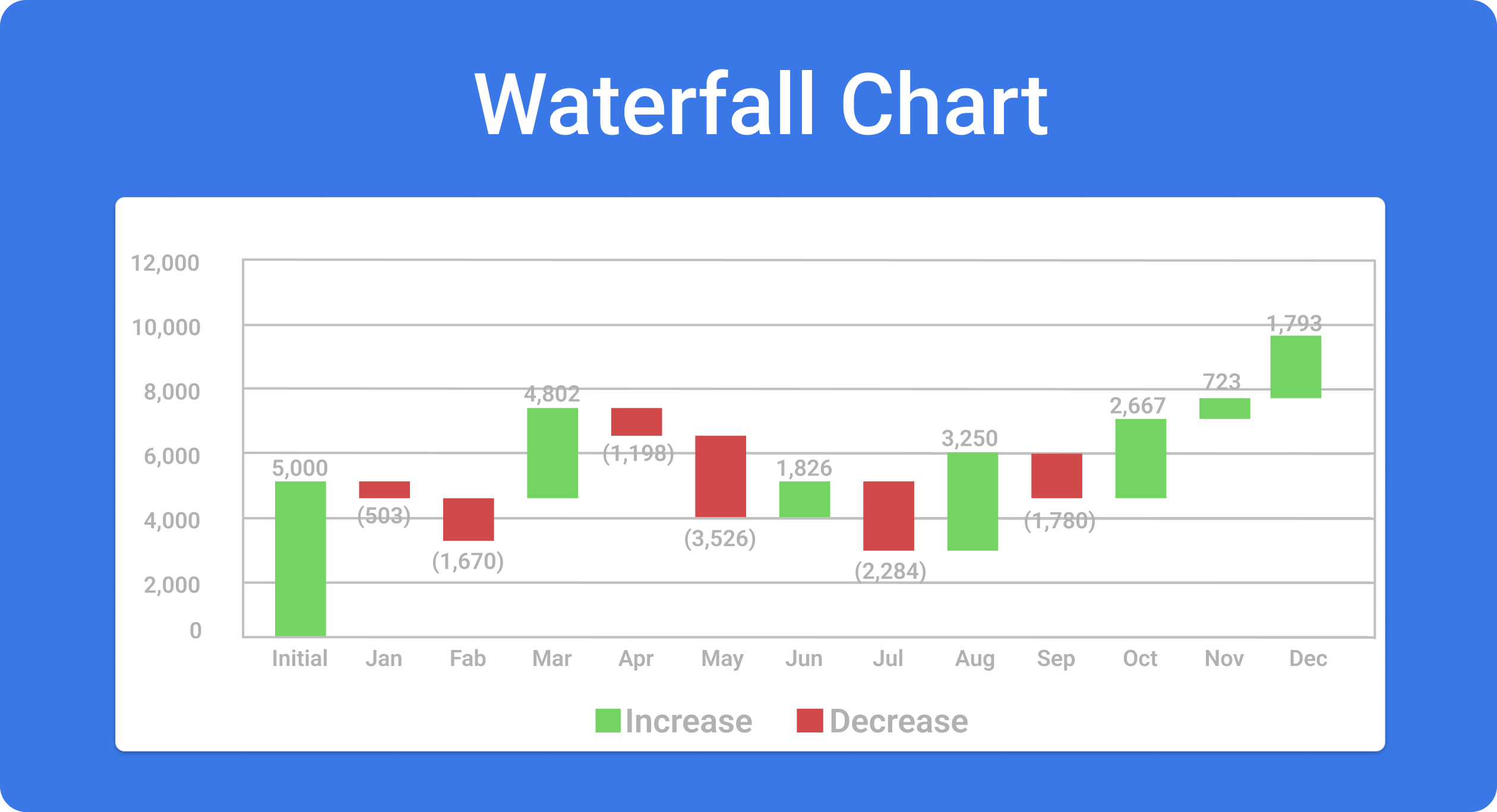
A typical or general waterfall chart is perused from a specific rule or order. Waterfall chart data values are read from left to right data flow. You see a time-being fluctuation on a subtotal value. However, on a software utility, these values are highlighted with colored bars through which the values are added or subtracted. The data categories on the horizontal x-axis usually stand at a fixed time period. These are called constants, such as months, weeks or quarters. This will empower you to assess the total values of data subject to read. For example, if the particular period of a month or week ended with a positive or declining trend of views and what the current status of the views or traffic looks like.
You can further differentiate the length of lines and colors against the specific and dedicated trends of data in the changeable or fixed time period.
Benefits Of Waterfall Chart
The Waterfall Chart is like the waterfall model that shows the differential comparison of some data values. Incremental or decremented flows are observed along with the following benefits.
- It helps showcase fluctuating variations in the quantitative data value of some categories over time of specimen effectiveness.
- It goes along following a logical data flow with an effective framework.
- The waterfall chart is essentially helpful in viewing the data as its specialised application for displaying the constituent flow of a larger data transformation.
- It comes into use when a statistics summary is not being assessed well with communicating the whole picture of data categories. Having a specified mechanism to depict the data value of change between two points may be beneficial. It might be the case. Otherwise, that turns to a line graph to show the frequency of different data values while still keeping the sense of quantity perceivable that a bar graph does a much better presentation of data provision.
The drawback of the Waterfall Chart
Obviously, like the benefits, there are some drawbacks to the waterfall charts.
- It gives bafflement to get with an application in the testing stage. It becomes very difficult to undo any change at a stage that was not well-arranged out in the basic display stage.
- No viable software or IT solution emerged until late during the product lifecycle.
- Big data saturation gives more risk and uncertainty.
- Not an ideal model for complex data and object-oriented data visualization projects.
- Unideal model for continuous and stammering projects.
- Not good for the projects where requirements are at the peak risk of changing.
Conclusion:
The waterfall chart is a compilation of bar charts, giving more elaborative information on complex data visualization with simpler effects. You can adopt this chart type to depict business analytics with a high data flow value.